237.130 A1 Week 3 – Draft 3

Q: Explain why the process of looking closely and thinking critically about visual texts is important to art and design practices

Why is the process of looking closely and thinking critically about visual texts important to art and design practices? Firstly, what is ‘critical thinking’? What does it require of us? What does it do for us? Wallace & co suggest that, “The term critical thinking in a broad sense can include all of the following: Creative thinking; Analysing; Problem-solving; Reasoning; Evaluating” (Wallace et al. 46). So, becoming a critical thinker requires these things of us: we must begin to think laterally and think about things from a variety of angles. In the following discourse I will be discussing the importance and relevance to art practice of critical thinking. Specifically, how the use of critical thinking shapes the individual’s art practice, as well as the importance of context as an element of critical thinking.

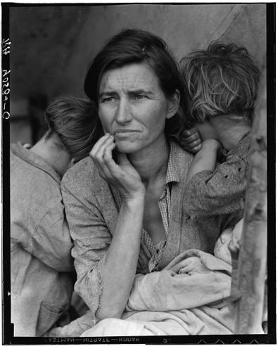
Context has a great ability to change the way and depth with which we see a visual text. As an analogy, take The Migrant Mother, the most famous photograph to come out of the great depression, by Dorothea Lange:

8b29516r
Lange, Dorothea, The Migrant Mother. 1936. Prints and Photographs Div., Lib. of Congress. Dorothea Lange Photographer of the People. Web. 23 March 2016.

Lange, Dorothea. The Migrant Mother. 1936. Prints and Photographs Div., Lib. of Congress. Dorothea Lange: Photographer of the People. Web. 23 March 2016.

In itself, photography is the documentation of a time, feeling and/or emotion. Without knowing the desperation of the Great Depression, would The Migrant Mother have as much impact? In “Reading Texts”, Ruszkiewicz and co suggest that, “Uncovering the context of a work breathes new life into it.” (Ruszkiewicz et al. 34). Context becomes key to assessing the importance and relevance of art and design because, “We read every text wanting to know how it connects with the world, both now and in the past.” (Ruszkiewicz, et al. 32). The reason context is such an important part of thinking critically is that it is the most human way we connect with the artwork and is a valid method of assessment – although we want to think critically and make sure that the processes undertaken in making art are “logical and convincing” (Wallace et al. 47), the relevance to society of an artwork will always remain an important part of how we value and assess work.

Thinking critically about visual texts is key in forming our own art practice, and making sure our art is relevant and meaningful. An example of this is Nick Kapica; in a lecture for the Communications in Creative Cultures paper, he revealed to us his working methods. He takes photos of visual texts within various urban landscapes, and collates these for future use. He assesses the visual aspects of each image and uses elements he finds interesting. The critical thinking here is key in not only assessing the material, but in being able to look for it in the first place. Often when you look at a space or an object, we don’t think of it as a visual text, but thinking  critically and creatively you open yourself up to a range of possibility for what a visual text, and essentially art, can be. Within our own art practice this will allow us to think broadly about what could be art – and different ways of saying that. In the same way, when we find a visual text, critical thinking allows us to ask different questions and find out more about the text; who’s the intended audience? What was the initial reception from this audience? How does the work use artistic conventions to convey an idea? In doing this, we learn to apply these questions to our own work, and so make it more purposeful.

At the beginning of this paper I didn’t understood the purpose of all this work. But in collating all this information, and writing this paper to the specifications, I have discovered that I’ve been analysing each piece of information and thinking critically about all of my work, as well as learning how to think critically about artwork throughout this assignment. Particularly in the field trip – learning to assess and think critically about something you don’t often think of as a visual text was really valuable. I agree with Wallace & Co’s statement that, “the whole point of going to university is to learn how to think.” (Wallace et al. 45). Learning to think critically, outside the box is what brings excitement to art, and allows artists and thinkers to be explorative and have new ideas – without that, what’s the point?


237.130 A1 Week 3 – Draft 2

Q: Explain why the process of looking closely and thinking critically about visual texts is important to art and design practices

In order to answer this question, I think it’s first appropriate to think about and explain the idea of ‘critical thinking’; what does it require of us? What does it do for us? “The term critical thinking in a broad sense can include all of the following: Creative thinking; Analysing; Problem-solving; Reasoning; Evaluating” (Wallace et al. 46). So, firstly, becoming a critical thinker requires these things of us: we must begin to think laterally and think about things in a variety of ways. “Doing something critically, in a critical way, means that you consider it actively, you engage with it” (Annals & Cunnane 15). To think critically is to engage your brain, and ultimately this will allow us more options when it comes to assessing, valuing and judging our own and others’ work, as well as creating artwork that involves a deeper thought process.

Thinking critically about visual texts is key in forming our own art practice, and making sure our art is relevant and meaningful. An example of this is Nick Kapica; in a lecture for the Communications in Creative Cultures paper, he revealed to us his working methods. He takes photos of visual texts around the world within the urban landscape, and collates these for future use. He assesses the visual aspects of each image and uses elements he finds interesting. The critical thinking here is key in not only assessing the material, but in being able to look for it in the first place. Often when you look at a space or an object, we don’t think of it as a visual text, but thinking  critically and creatively you open yourself up to a range of possibility for what a visual text, and essentially art, can be. Within our own art practice this will allow us to think broadly about what could be art – and different ways of saying that. In the same way, when we find a visual text, critical thinking allows us to ask different questions and find out more about the text; who’s the intended audience? What was the initial reception from this audience? How does the work use artistic conventions to convey an idea? In doing this, we learn to apply these questions to our own work, and so make it more purposeful.

An important aspect of thinking critically is context, and its ability to change the way and depth with which we see a visual text. As an analogy, take Migrant Mother, the most famous photograph to come out of the great depression, by Dorothea Lange:

8b29516r
Lange, Dorothea. The Migrant Mother. 1936. Prints and Photographs Div., Lib. of Congress. Dorothea Lange: Photographer of the People. Web. 23 March 2016. 

In itself, photography is the documentation of a time, feeling and/or emotion. Without knowing the desperation of the Great Depression, would this image have as much impact? In “Reading Texts”, Ruszkiewicz and co suggest that, “Uncovering the context of a work breathes new life into it.” (Ruszkiewicz et al. 34). Context becomes key to assessing the importance and relevance of art and design because, “We read every text wanting to know how it connects with the world, both now and in the past.” (Ruszkiewicz, et al. 32). The reason context is such an important part of thinking critically is that it is the most human way we connect with the artwork and this is a valid way of assessing – although we want to think critically and make sure that the processes undertaken in making the art are “logical and convincing” (Wallace et al. 47), the relevance to society of an artwork will always remain an important part of how we value and assess work.


237.130 A1 Week 3 – Draft 1


  • Explain critical thinking. What does it require? What does it do for us?


Reference: Wallace, Schirato, Bright. “Critical Thinking” – use quotes from here; their idea of what makes up critical thinking. The idea that critical thinking makes us better students and artists – why? Releases us from normal thinking paradigms?

Nick Kapica: How thinking critically allows him to see visual texts within urban landscapes and form there analyse them and use them as material for his own ideas. – seen from the field trip experience. It’s surprising how much you can think about a site when you sit down and just think critically about it.              


  • How does thinking critically about others’ art inform our own art practice?


Reference: Nick Kapica – lecture about his looking at others’ artworks and specific visual texts within the landscape and how this made him more aware of what elements he was drawn to; he then uses those elements and ideas later in his own work.

When we look at an artwork and assess it we’re thinking about aspects such as the intention of the artwork and the meaning – who is the audience and what will they think? How do the formal conventions within the artwork convey this message? By analysing others’ artwork this way we can bring that way of thinking to our own art practice and ultimately refine the purpose, and methods of our work.


  • How is context important to thinking critically?


Reference: Ruszkiewicz, et al. “Reading Texts” 32-34; Mirzoeff, Nicholas “How to See the World” Introduction.

Talk about how “Reading Texts” explains what context does for the artwork, and Mirzoeff exemplifies this and also shows how context influences judgement and reception of an artwork.

Potentiall use the example of the blue marble? Or of Migrant Mother by Dorothea Lange – how does this image stand up withotut its context – and how do we think about it if we didn’t0 have the context. Would the judgement of the work be different?


237.130 A1 Week 3 TASK 2- Reading Response

This is a response to “Critical Thinking.” Beginning University: Thinking, Researching and Writing for Success, by Andrew Wallace, Tony Schirato, and Phillippa Bright. St Leonards, N.S.W.: Allen & Unwin, 1999. 45-61. Print.

Personal Response

I think the points the authors make about critical thinking and about university itself are really key to remember when you’re in the situation. Often, I find myself wondering what the point of this whole paper is, but I guess it’s all about critical thinking, and stimulating different ways of seeing, thinking, and making judgements. It’s easy to just get lost in the task and just read it, then write about it without really taking a second to think about the greater context and importance of what you’re analysing or thinking critically about why you are doing it. But critical thinking and lateral thinking allows us to broaden our options and think of different ways of doing things, and that will always be an extremely necessary tool in art making.

The Authors’ Voice

The authors’ voice in this passage is quite different to most of the other readings in that it has a much more formal, academic tone. It makes use of specific vocabulary that gives the writing credibility and formality, and the sentences are well structured. For example, the sentence, “Knowledge and behaviour tends to be organised in ways appropriate to some dominant paradigm.” (Wallace, Schirato, Bright 48). It sounds academic, and it sounds knowledgable. The authors also make use of the pronouns ‘you’, and ‘we’, and reference the the audience and themselves as apart of the same group. It allows the piece to be relatable while still holding a formal tone, and almost giving advice. I think this piece was well written, it wasn’t difficult but it challenged me to think about what I was reading, and analyse what the authors may mean. I think it gives a lot of insight into the purpose of this paper, and also a reminder to always be thinking broader, and trying to challenge myself.

237.130 A1 Week 2 TASK 1 – Importance of Context

This is a response to the reading by Ruszkiewicz, et al. “Reading Texts”. Beyond Words: Cultural Texts for Reading and Writing. 3rd Edition. Boston: Pearson, c2012. 9-39. Print.

Context is a key part of what we use to analyse and criticise anything we see. As said in the reading, “Context is nothing more nor less than the who, what, where, when and why that surround every word, image, or artefact” (Ruszkiewicz, et al. 32). Context is essentially the conditions that forged the product, and they effect the whole of the work, from the target audience, the intention and the appearance of the final product. The reading also suggests that, “uncovering the context of a work breathes new life into it” (Ruszkiewicz, et al. 32). I think this is very true for any work, in that art can only be so interesting at face value; once you start to look at the who behind it, and the why and, ultimately, the feelings and thoughts surrounding the artwork, you get to the true meaning of creating art. Dorothea Lange’s Migrant Mother photograph is nothing without the knowledge of how desperate her situation was at the time of the Great Depression. Context also allows us to bring our own personal context to our reading of the text and makes the viewing and analysing process a unique one.

237.130 A1 Week 2 TASK 4 -Visual Text Analysis

This is a Smirnoff Billboard seen on Cuba St.

Site_1-02 edited
Smirnoff ‘We See #Purepotential’ Campaign. Cuba Mall. 2016

At first, it’s a very impactful image in terms of its design elements. It feels very now, and current and uses a simple white background and a single focal point to simplify its ideas and intent. The focal point is the fruit in the glass and its quite interesting in its use of space; the fruit seems squished in, yet balancing on top of each other precariously with the glass framing them, encapsulating the objects. The colour is especially interesting to me and the reason I chose this text, I think the colour of the passionfruit and the peach is great and is a selling point in itself to see such vibrant, fresh flavours; it’s enticing. It’s quite emotive of summer, and feels fun. Then in the right hand corner there’s some subtle branding. This continues the simplicity of the image, in that there’s only one sentence and a simple image that eloquently conveys the brand, Smirnoff. The type is in the brand’s iconic red, and says simply “WE SEE #PUREPOTENTIAL”.  This says a lot about what the image is suggesting, it’s simple and yet it speaks of something more, something to come, something to be enjoyed.

The ad is apart of a large campaign designed by Special Group, a New Zealand based design and marketing agency, and is part of this series that takes fresh, raw ingredients and positions them inside and around cups and suggests ‘potential’:

Screen Shot 2016-03-17 at 12.28.32 pm

They all make use of vibrant colour and simplicity, and I think are very effective. On their website, Special Group has a blurb about the campaign that gives a lot of background context to the ideas. They say, “Smirnoff is the world’s biggest selling Vodka brand, but it needs to maintain its relevance to the younger drinker. We were tasked with creating a campaign platform that positioned Smirnoff as the catalyst for amazing social times.” I think this really speaks to a younger generation, with more contemporary design feel, and the use of an Instagram campaign to go along with the billboards, and create an interactive experience.

237.130 A1 Week 2 TASK 3b – Comparing and Contrasting

What’s different?

The main difference is in the visual appearance of the labelling/advertising of the two. The supermarket labels tend to use a lot more type and are more informative than the billboards. As seen in the Steinlager billboard, the focus is on the imagery and use of colour, rather than information. It suggests an idea, rather than informing a decision.

What’s the same?

I found it interesting that both these images/objects immediately drew my eye. I think that both images have used the colour of the objects themselves and the simplicity of that to sell the product. For the fruit, they are kind of selling themselves, and so the packaging does not need to be as suggestive, but the Smirnoff ad uses the enticing qualities; colour and texture of the fruit to sell their image.

It also shows the common goal of both sites of selling an image, but also highlights the differences between the sites in that their method of this advertising is quite different, as is their target audience.

237.130 A1 Week 2 TASK 2 – Fruit & Vege Packaging, New World Metro – Site 2

Like the billboards, the packaging of fruit and vegetables is an advertisement. The format and design of the packaging is based around the target audience and the idea the brand wants to convey. Unlike billboards, though, the advertising on fruit and vegetables is more informative and works upon the idea that the audience is already at the supermarket, and so the advertising informs rather than suggests.

Fruit and vegetable packaging employs standard fonts and simple, informative labels. As people walk around the aisles, the fruit and vegetables are displayed and a lot of the time, the fruit speaks for itself; like the appeal of the green Melon or vibrant Paw Paw. The supermarket itself revolves around the objects within it, and these are the centre of attention. Often there are labels like the “SAVER” label, which draw attention to specials, and use contrast and bold type to draw attention.

The supermarket works essentially as a vessel for these products and I think it’s important to note that the institution is called ‘New World Metro’ and is positioned in a very busy spot on Willis St. People are often moving through here in their lunch break or on the way to somewhere and so the layout and atmosphere of the supermarket also effect the way the products are labelled. The fruit and vegetable section is the first you walk through, and you must go through the fruit and vegetables to get anywhere. A lot of the advertising, such as the saver label, has to quickly draw people in, while still providing valid information. On the products, the price is the first thing you see, and this helps people make quicker decisions easily.

Site_2-07
All Good Fair Trade Banana’s Brochure. New World Metro, Willis St. 2016

Some brands, when there is competition employ other tactics to sway the choices of the consumer, and again have a target audience. Pictured above is an All Good bananas brochure, which was the only one of its kinda we saw. It showed that more so than other fruit brands, All Good were trying to sell an idea; that they are “NZ’s Best Kids Food”. They are also advertising the symbol that their bananas are fair trade certified. It shows that All Good are trying to sell an image of virtuousness.


237.130 A1 Week 2 TASK 1 – Billboards around Wellington – Site 1

billboard noun

  1. a large outdoor board for displaying advertisements; a hoarding.

Our first task as a group was to scout out Billboards in Wellington’s city centre. As intended, they weren’t hard to find. Billboards are suppose to draw your eyes, and to convey a simple suggestion about a brand or a product, and we found that their ways of doing this were simple but effective. As seen in the ANZ Go Money and Steinlager Billboards:

“All artefacts are products of specific conditions,” (Clarke 25). When analysing these billboards, Clarke’s suggestion that all things are products of “specific conditions” can be applied; the Billboards are products of their placement, target audience and subject matter. I.e., the Steinlager ad is positioned on the Sharp Building on Taranaki St. It looks over a busy intersection, and from this we can assume that the main audience would be motorists, and therefore adults. It then makes sense that an alcohol advertisement would be placed here. We then can take those conditions and apply Clarke’s suggestion again in saying that because the ad is aimed at motorists, the use of wording is minimal, and instead the the ad captures attention with colour and form, and gets the point across quickly with the large brand name and matching brand colours.

Site_1-04
Tui Ad. Taranaki St. 2016

A Tui Billboard we came across, also on Taranaki St, employed the use of narrative to suggest consuming its product. As is common in alcohol advertising, it suggests that drinking Tui is synonymous with being apart of New Zealand having a, “good life”, enjoying good company and generally having a great time. This narrative can be harmful in that it continues to promote an already terrible drinking culture in New Zealand. Often the target audience here, adults in the CBD, are on their way to work and wishing they weren’t, and this ad reminds them that this weekend they can be somewhere better, with the help of Tui. If I was to analyse this an image, I would also say that the use of blue in the background contrasts the golden colour of the lager, and draws attention to it. It also evokes feelings of being warm, and enjoying the summer period, a time New Zealanders love. It is effective in its placement, and use of visual elements.

I think it’s also interesting to note that out of  11 Billboards we saw around Wellington, half of those were for alcohol. I think it says a lot about our drinking problem, and just how susceptible to alcohol advertising we might be.